Monday, April 11, 2011

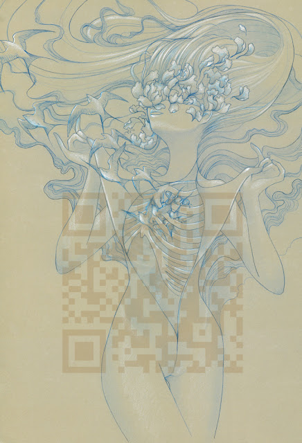
Poster: Euphoria

This was the "Drawing Happiness" project for my Studio and Research class. I wanted to add more detail but since I had to have it finished by a certain time to get it printed in time I ended up cutting a lot of detail out, I left just enough in so that it would look and feel more complete. I spent a lot of time playing around with the colors and came up with two great color schemes. The darker version was selected for a Daily Deviation on DeviantArt.com which got me a lot on attention on DA. It was nice :)

Blue pencil + White Pencil Crayon on Grey BFK Rives. 

Euphoria (Warm)

Euphoria (Cool)

I ended up printing them as posters measuring about 24 x 34 inches and selling them at the school show and sale for $60.00 CAD each. They didn't sell as well as I wanted  them to mostly because almost everyone who comes to the ACAD Show & Sale are looking for more tangible/one-of-a-kind items like sculptures, canvas paintings or jewelery. However It did get me noticed for being a more stylized illustrator, and I got the attention of the Sled Island Music Festival Coordinator, which might land me an illustration gig in may for the festival. Keeping my finger's crossed for that one. And the fact that I'm not even in the design/illustration major yet got me pretty stoked.

Poster: Be Among the Stars

This is a project for my Urban Landscape class a couple weeks ago. The assignment was "Future Cities"

I ended up taking the project to a very literal sense with art deco posters as my inspiration. It's pretty much an advertisement poster of some sort set in a time where humans have fully colonized the Earth and the Moon. Now they're looking at ascending beyond the Moon to be among the stars in some megalopolises set in spiffy looking snow dome looking space stations/colonies.

I was also inspired by Les Brown's famous quote "Shoot for the moon, even if you miss you'll land among the stars."

20 x 45 inches


I'm going to start uploading some of my favorite projects from the past 2 semesters as I'm nearing the deadline for my VC application portfolio.

More Botanical

More botanical progress shots. I like documenting my progress to a certain extent.

$20 + Heiny + Hardcore inking project = Work Hard, Party Hard!

ink ink ink ink line line line line

Photo: Vibrations from one to Another

I instantly thought of creating a visual representation of sound. More specifically I was thinking of an experiment where they put a board on top of a large speaker with salt sprinkled all over it, then pump sounds out. the sound frequencies will create a visual pattern with the salt. I came up with 3 panels of my favorite patterns. 

Art created from Science is the ultimate form of natural beauty to me.

mm salty...
I ended up distorting the photos a lot to get the gritty salt grainy feel. It is a fine art project after all so I can get away with doing that hehe. I wanted the "wave patterns" to look like sound waves more than actual piles of salt. I'm very happy with the way they turned out!

Collaboration

Here's a little something I'm currently working on for a group project in my Urban Landscapes class. We chose to work with the idea of community/collaboration where ideas a re communicated and interpreted by a different group member. My group members, Bronson and Kate presented me with these concepts:

"Vibrations from one (through a substance) to another" ~ Bronson

"Shot in the Dark" ~ Kate

From here I am to create two separate pieces that show how I interpreted their ideas. I hope that all made sense. 

Illustration: Botanical Project

I'm currently redoing my botanical project for my VC (Visual Communication) application portfolio. The outline to the project is to basically reproduce in pen and ink a chosen photo of a botanical garden, in this case one of the tropical areas of the Calgary Zoo. The student must be able to demonstrate a sense of foreground and background and tonal values. The student must also include 2 inserts of a specific plant int the the image as a detailed study. Fun times!
Original image with a couple classmates in it. Adrian was one mad bro when he found out I took him out of the picture.

I feel like such a studious art student when I look at this photo. teehee
and I love seeing photos of work spaces. There's just something very genuine and honest about the work being produced when you can see the environment it's being created in.

pencil pencil pencil

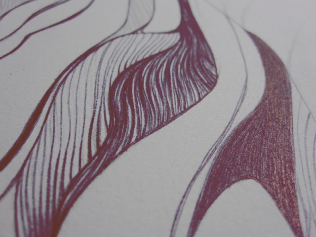
ink ink ink. in 0.05, 0.1, 0.3, 0.5, 0.7 fine liners.

Tuesday, April 5, 2011

Almost

I'm almost done! Just need to add a little more detail to the fish side and then I can scan for Photoshop manipulation. However, I'm in dire need for a wide/large format scanner of my own -__- I hate paying the incompetent print shops to get stuff scanned.

The piece will be displayed as a triptych once completed. Each panel is approx 10 x 22 inches.

Monday, April 4, 2011

Long Time No See...

Sorry, I haven't posted anything since forever back. Been soo busy with school work and all that haven't had time to make any personal work, well more like work on any I really want to post on here.

I've decided to focus this blog more on work that I'd like to progress with my design and illustrative studies at school. Just to prove I've been hard at work I'll post a few pics of one of my current school projects Therefore I'm going to be deleting a lot of my old posts on here. Starting fresh...kinda.

The theme of the current project that was given to me in my Stdio & Research class was "fashion, allegory and likeness". Here's my interpretation (a work on progress at the moment)

Yeahhh, I know I'm stealing ZSO's method of work documentation :P

the key to great design is planning. roughs roughs roughs!

yes that is ice cream.

ooooh yess.....

Chaetodon Auriga - Thread Fin Butterfly fish


found black ink bic pens and the first Zanclus cornutus - Moorish Idol inked.